Infographic Style Template
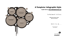
Transcript: Point 1 Add content (frames, images, video, text etc) here Containment Actions Add content (frames, images, video, text etc) here Add content (frames, images, video, text etc) here Point 5 http://www.jim-harvey.com Point 2 Add content (frames, images, video, text etc) here A Template: Infographic Style Add content (frames, images, video, text etc) here Point 3 Add content (frames, images, video, text etc) here By Jim Harvey: Add content (frames, images, video, text etc) here http://www.jim-harvey.com Point 4 Still to do...