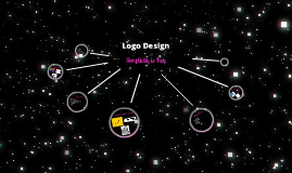
You're about to create your best presentation ever

Presentation Template For Logo Design

Create your presentation by reusing one of our great community templates.

Logo Design

Transcript: Logo Design By Iva Nikolaeva 8T What dO I need 2 do! The design brief of the task was 2 make a swing tag for clothing Criteria 4 Success: A well designed image for logo will have... Appropriate colours and shapes the companies name some of both picture and text an image that represents clothing Investgating: Design Limitations: The factors that will limit my design work are... not consontating in class not doing work at home if i'm behind not making use of class time computer problems ?Thinking? Make a List: Teens Dreams- teenage modern clothing Levie- Adult and teenage modern clothing Happy Faces- Clothes for babies and toderlers Mad Fig- Adult clothing Allies- All age clothing Sketch 1 Sketch 2 Sketch 3 Sketch 4 Making What Materials and Tools can I use? I can make my swing tag logo in the shape of a fig I will use bright colours to make its stand out. I can use carboard when printing out my swing tag Risks: I have to consontrate and not get distracted when designing my logo. I have to make sure I have my carboard ready about a week early Plan my time well, and be on track. Results EVALUATION Thanks Mrs Hampson!!! :) (cc) photo by Franco Folini on Flickr Front of swing tag Sketch 5 (cc) photo by Metro Centric on Flickr THANK YOU Mrs Hampson ! I wrorked well through the designing, and if I had more time I wouldn't do another logo because I'm happy with it and I had plenty of left over time anyway. I found making my design easy. My Time Management Plan: Back of swing tag I managed to finish my logo and swing tag before I was ment to finish and I'm happy with it. (cc) photo by Metro Centric on Flickr I managed to finish on time and didn't get distracted (cc) photo by jimmyharris on Flickr

Logo Design

Transcript: Type your name (or a potential name for a company). Format it using a basic san-serif font, for example, Century Gothic, Helvetica, Avant Garde, News Gothic. Convert the type to outlines. Select the type with the pointer tool, Go Type - Create Outlines. Creating outlines transforms the type to vector artwork, making it editable. Manipulate/distort/transform the individual letterforms to create a unique style. Often subtle changes are the most effective. You do this by selecting the individual node points on your letters with your white pointer tool, simply pull out the nodes for a different effect. You can also add new nodes using the options of the pen tool on the tool palette. Select the pen tool with the + sign next to it, and click on the area where you want to add a new node point Step 2 Go Object - Compound Path - Make. This groups the individual outlined letters together. Fill in the letterforms with a gradient. Go Window - Gradient - Select linear. To change the colours, drag new colours onto the Gradient Palette slider bar from your Swatch Palette, to delete colours simply drag them down off the palette. Step 1 Create a simple drop shadow by copying then pasting to back, nudging offset and filling with black. To enhance your Logotype add a company byline (supporting text), also shapes could be added to emphasize the company name/logo. Use these Steps on how to make a logo on Adobe Illustrator. Step 4 image Step 3 Introduction Illustrator How to make a Logo

logo design

Transcript: I chose to do a basketball theme logo simply because i love basketball. I love to play it watch it especially the NBA, were my idea to this logo came from. I realised the NZ Basketball Association did not have a photo logo after browsing for hours trying to find one. I decided i would create one for them. I begain to browse pictures online of NBA players. I decided i would look at my favourite type of shot called the 'fade away ' to see what i would find. After i found a group of pictures of 'fade away' shots i looked at who in my oppinion is the king of fade away shots and my favourite picture of them doing a fade away shot. I decided Dirk Nowitzki was the king of the fade away shot as he scores the most points from executing the shot, so i chose one of his photos. Once i had the picture i liked, i placed it in photo shop and cut Dirk from the background with the magic wand tool and pen tool to use him as a template for my logo. once i had my template i made it completly black and made the background white by using the magnetic tool and the paint brush. I drew a circle above the hands, to represent a basketball and used the effect of glowing edges to make the image stand out aswell as turning the image more on angle to give a better look. i begain to make different designs from my basic black and white photo, by adding different colours using the masking tool and adding images of ferns or maori designs to make the logo more 'kiwi'. I realy liked all my logos so i asked other students what there favorite logo was the top three were. I realy like this design it stands out and represents New Zealand realy well through the colours This design is great it realy does look good however it does not represent New Zealand I like this design it represents New Zealand through the maori design but dose not stand out that good. After listning to other students feedback i came to the decision that this is my logo because it stands out and represents New Zealand realy well. thankyou for viewing my presentation my logo FINAL LOGO back Letter heads CREATING MY FIRST BLACK AND WHITE LOGO CREATING COLOURFUL AND IMAGE INCORPORATED IMAGES back (cc) image by nuonsolarteam on Flickr DECIDING ON MY PHOTO CREATING A TEMPLATE FOR MY LOGO MY LOGO -NZ BASKETBALL ASSOSCIATION RESEARCHING PHOTOS ONLINE front WHY DID I CHOOSE TO DO THIS TYPE OF LOGO DESIGN? using my final logo in a business card for my chosen organisation DECIDING ON MY FAVOURITE LOGO... front

Logo Design

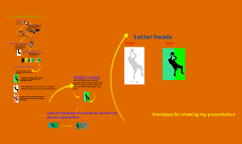
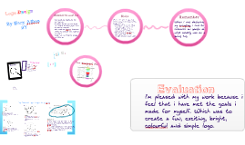
Transcript: Logo Design By Mary Athos 8Y A successful logo & swing tag to me will be exciting, colourful, appropriate size, appropriate logo picture, clear and easy to read, matches the brand name and will attract a customer. Tag labelling requirements: Sketch 5. P. The "Peach" and the "blue" is shown and the surf board represents the beachy theme. M. It could possibly be a bit too simple. I. How all the key words (peach, blue, beachy) combine together My logo is for a brand which is a beach shop, which sells, swimmers. surf boards, beachy clothes & accessories . Logo: Materials we could use We could use fabrics to iron our logo on. In order to iron on our logo's we needed transfer paper which is another material. We could use Abdobe illustrator where we created and designed our logo's. Lastly we had Prezi to design our folio on. I'm pleased with my work because i feel that i have met the goals i made for myself. Which was to create a fun, exciting, bright, colourful and simple logo. Change to a peach (cc) photo by Metro Centric on Flickr We only have one program and if it is difficult for us to work with that program is the only one we have. My Different Logo Designs & the PMI's Time managment plan Success! P: It matches the shop, girly, fun, pink. M : Quite simple swing tag front: DESIGN LIMITATIONS Sketch 1. P. Clear and easy to read. M.There is not much to it I. The way the brand name fits in nicely with the shape. In this project we had to design a logo and a string tag. Risks Must have a barcode The time we have to do the project is less than 1 term, and we have lost 1 week. 3. P: The symbol is an interesting symbol and the logo has style. M: It is very simple and isn’t very exciting. Criteria for success Sketch 3. P. The seashell matches the beachy theme M. It still doesn't 100% match the brand name. I. The lines on the shell show its real texture. (cc) photo by jimmyharris on Flickr What type of clothing (cc) photo by Franco Folini on Flickr I was aiming to achieve a bright, colourful, exciting logo, that had a beachy feel to it but was still simple. The colour P: It is fun, colourful, exciting and with its bright colours it can attract people to the shop. M: There is not much shape to it. P: Even though it’s simple it still has something extra to it. M : Not much to match the title Evaluation 1. Blue bliss 2.Sea breeze 3.Peach N' Blue 4. island escape 5. summer fantasy Must have the brand name My final logo and swing tag! There were some things that could send you off track in this design process. Getting stuck on one thing that slows you down. for example getting stuck on scanning your sketches. Not being quick enought to make your mind up. For example picking a brand name. When I was designing my swingtag, i had to research on google of what exactly was on a swing tag Investigating Thinking 5. Sketch 2. P. It looks very fancy and exciting. M. It doesnt go with the brand name. I. It's meant to be a tropical flower but it doesnt exactly look like one. 4. For the tag i will have a rope attached to it. To connect to clothing etc. Remember ✞ We also had to create a folio using prezi containing our process to create a Logo! Change to a peach Logo! Logo evaluation: swing tag back: Final design Sketch 4. P. This seashell also matches the beachy theme. M. It doesn't look very realistic I. The waves representing the blue on the shell representing the beachy theme combines. The program we're working on is new to us and we don't have time to settle into it. we had to design the shape, colour, "tag" and how we presented it. We also had to put all the basic things that are on a string tag, for exampe the barcode, price, brand etc. (cc) photo by Metro Centric on Flickr Logo research: P: This logo is stylish and classy M : doesn’t have colour in it. A list of 5 business names for my logo: 2. The size of the clothing (if it's clothes) Limitations! 1. ✞ Design brief

Logo Design

Transcript: Graphics Term 1 Weeks 1-10 From 8y (8t) Logo's and Swingtags are an important part of clothing, as they are attached and printed on clothing and represent the company they are from. And thats exactly what we had to do. We had to design our own Logo, and Swing Tag. Don't know what a Logo is? Here's an Example Its The APPLE Logo!!! :) Your Probably aslo wondering what a Swing Tag is as well... Here's another example: Results (cc) photo by Metro Centric on Flickr doodles Design Limitations are important, without them, our projects would fail and we wouldn't do everything right. Like the amount of time we had e.t.c Budapest Design Brief By Harrison Newman San Francisco A swing tag is... Notes A well designed graphic image for a logo and swing tag will... 1. Not be pixelated or poorly coloured 2. Have a good flow to it, not be abrubt in the colour change 3. The swing tag will be made from the right materials. 4. The swing tag clearly have the right items shown on it: Barcode, where the item was made, the logo e.t.c Stockholm (cc) photo by jimmyharris on Flickr (cc) photo by Franco Folini on Flickr What Work we do and where, like in class or in school time, and what time we do that work. Losing time at school because of events or excersions, can limit us on the time we have, like Open Day (23rd of March) we will lose a double lesson :( A Logo is a graphically designed emblem or mark that are used by companies in; , television, billboards, labeling, clothing, shopping bags, Cars, Electronics and many more things. This is so the public can intantly recognise that company when buying one of their products. Some Logos carry great esteem, which atracts consumers to that product, because when people see that logo, they will think of that company and its values. A swing tag is the tag that swings from a piece clothing. It is different to the care label (care label is attached on the inside of the garment with information about how to take care of it and flammiblity warnings). It has the brand/logo printed on it, the price, the size, the name of the garment, etc. Design Limitations What Programs we use and how; like Prezi, and Illistrator... (cc) photo by Metro Centric on Flickr Criteria For Success Outlook Important Details A Logo is...

Now you can make any subject more engaging and memorable